Picking the perfect paint color can feel like trying to find a needle in a hardware store. Trust me, I’ve been there – standing in front of endless paint swatches, feeling overwhelmed by the subtle differences between “Morning Mist” and “Coastal Fog.” According to This Old House, this is one of the most common challenges homeowners face during renovation projects.
The Psychology Behind Paint Colors: Setting the Right Mood
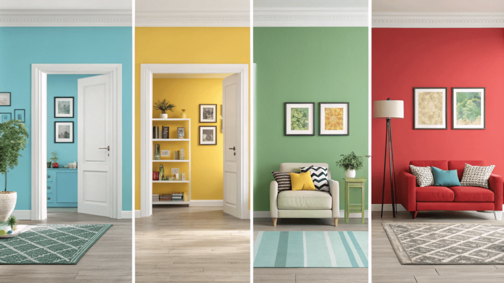
Martha Stewart Living explains that color selection is less about following trends and more about understanding how different hues affect our mood and behavior. I learned this the hard way after painting my home office a vibrant red, only to find myself feeling anxious during important video calls! The specific colors, shades and undertones can greatly affect how your room feels.
Different colors evoke different emotional responses:
- Blue tones such as soft blues, and light blues, which are known to promote calmness and productivity. These colors are often used in bedrooms and bathrooms to create a relaxing environment.
- Green shades such as sage green, mint green, and forest green that are known to connect us with nature and foster creativity. These colors are often used in offices, living rooms, and other areas where people want to feel more energized.
- Yellow hues such as bright yellows, and pale yellows that are known to boost energy and optimism. These colors are great for kitchens and areas that don’t get a lot of sunlight.
- Red increases intensity and passion, and should be used in small doses or as an accent color.
- Purple adds sophistication and luxury, and should be used sparingly to create a high end look.
- Neutral colors such as beige, gray, and whites that create versatility and balance, and are often the best choice for main areas of your home.
Room-by-Room Color Selection Guide
Living Room: Your Home’s Heart
The living room sets the tone for your entire home. As Blesser House suggests, focus on creating a welcoming atmosphere that looks good in both daylight and evening hours.
Best Colors for Living Rooms:
- Warm neutrals (such as Benjamin Moore’s “Revere Pewter”) that create a warm and inviting atmosphere that can also be used as a base color to build on.
- Soft blues (Sherwin-Williams’ “Sea Salt”) that are often used to create a calming and relaxing environment.
- Gentle greens (Behr’s “Sage Green”) that help create a connection with nature and also add a sense of peace and harmony to your living room.
Pro Tip: Better Homes & Gardens recommends testing paint samples during different times of day. What looks perfect at noon might feel too dark by dinner time. Be sure to use large samples (at least 2×2 feet), and test these swatches in multiple areas of the room and on multiple walls. This will help you better understand how the color will look during different lighting situations.
Kitchen: The Heart of Activity
Your kitchen needs a color that energizes without overwhelming. Gold Coast Canvas provides excellent guidance on selecting kitchen colors that stand the test of time:
Kitchen Color Recommendations:
- Crisp whites (Benjamin Moore’s “White Dove”), which make the kitchen feel bright and clean. Whites are highly versatile, and a good choice for any type of kitchen design.
- Soft yellows (Sherwin-Williams’ “Butter Up”) that make the space feel warm and welcoming. They are a great choice for kitchens since they make the space feel more open, and bright.
- Pale greens (Behr’s “Fresh Mint”) that help to bring a feeling of freshness and nature into the space.
Bedrooms: Your Personal Sanctuary
When it comes to bedrooms, Homemade Lovely suggests thinking serene and soothing. After painting countless bedrooms, I’ve found these colors consistently create the most restful atmosphere:
Bedroom Color Suggestions:
- Soft lavender (Benjamin Moore’s “Violet Pearl”) which are often used to promote a calming and restful environment.
- Gentle gray (Sherwin-Williams’ “Repose Gray”), which are extremely versatile, and can create a feeling of peace and calm.
- Pale blue (Behr’s “Watery”) that creates a soothing and calming environment that is perfect for bedrooms.
Bathroom: Clean and Fresh
Refined Rooms LLC emphasizes choosing colors that feel clean and bright while complementing your fixtures.
Bathroom Color Options:
- Spa-like blues (Benjamin Moore’s “Glass Slipper”), which help to create a relaxing and refreshing environment that reminds you of being at a spa.
- Crisp whites (Sherwin-Williams’ “Extra White”) which helps make a small bathroom feel more open and bright.
- Soft greens (Behr’s “Windwood Spring”) which can add a touch of nature to your bathroom and will help create a calming and serene environment.
Budget-Friendly Paint Selection Tips
As someone who loves a good deal (and has decorated plenty of spaces on a tight budget), here are my tried-and-true money-saving strategies, supported by Thistlewood Farms:
- Buy Quality, Not Quantity:
- Invest in good primer, to ensure you need less paint for your project. A good primer will help seal the walls, and provide a smooth base for your paint.
- Choose paint+primer combinations for better coverage, as this type of paint will often cover the walls more completely, and require less coats than traditional paint options.
- Look for sales at the end of painting seasons. Many paint stores will have sales at the end of the painting seasons (spring and fall). This is a great time to purchase paint at a discounted price, and to get a better deal.
- Sample Smart:
- Use peel-and-stick paint samples instead of buying multiple sample pots. Peel and stick samples are less expensive than paint samples, and are easier to apply to the wall.
- Test colors on multiple walls before committing, since colors can look different on different walls. You should also take into consideration if you have any accent walls, or if your walls are close to windows, which can impact how the color will look.
- Consider lighting changes throughout the day, and make sure to view the sample during different times of day and also in different lighting situations (artificial, and natural light), as this will show you exactly how the paint will look throughout the day.
Common Paint Color Mistakes to Avoid
This Old House highlights these common mistakes to avoid:
- Ignoring Undertones Not all whites are created equal! Some have warm undertones (such as yellow or red), and some have cool undertones (such as blue or grey). When choosing a white, be sure to test your samples next to your existing furnishings, to see if it compliments or clashes with your current décor. This is also an important consideration for other colors, as their undertones can greatly influence the overall feel of the room.
- Choosing Colors in Store That perfect gray in the store might look purple in your home. Always test in your own space, and view the swatches in different types of lighting. Since lighting is very different from a store, your home lighting will have a big impact on how your color will look in your home. You should also consider if you have any natural light, as this will also influence how a color looks.
- Following Trends Blindly Remember Avocado Green Appliances? Exactly. Choose colors you love, not just what’s trending. It is important to consider your personal preference when making a color choice, as you will be the one who will be living in that space.
Seasonal Color Trends vs. Timeless Choices
While Better Homes & Gardens keeps us updated on trends, there’s something to be said for timeless choices. Here’s how to balance both:
Current Color Trends
- Earth tones and natural elements, which includes shades of green, brown, beige, and terracotta which can help add a feeling of nature into your home.
- Moody, saturated colors, such as deep blues, greens and purples, which can create a more dramatic look.
- Vintage-inspired pastels, which can add a feeling of nostalgia, and can bring a unique style to your home.
Timeless Colors That Never Fail
- Warm whites such as off-white, and creams, that make a space feel open, bright, and inviting.
- Soft grays which offer an extremely versatile option that can be used as a base, and also create a clean and neutral look.
- Classic navy that is a deep and sophisticated color that makes a bold statement, while also being timeless.
The Testing Process: Getting It Right the First Time
Martha Stewart Living recommends this foolproof testing method:
- Get Samples: Paint large swatches (at least 2×2 feet) on multiple walls, so you can accurately see what the color will look like in your space.
- Observe Throughout the Day: Look at the color during morning, noon, and night. How does the color change? Is it still the right choice? The color will look very different depending on the lighting conditions.
- Consider Your Lighting
- Natural light: Make sure you check the color during different times of day, to see how the natural light affects it
- Artificial light: Check how the color looks with your lamps and overhead lights on.
- Seasonal light changes: Remember that light changes between seasons. You should try to see how the color will look in the summer, and in the winter, as it can change depending on the seasons.
Expert Tips for Color Coordination
Blesser House suggests these tips for creating a cohesive color scheme:
- The 60-30-10 Rule:
- 60% dominant color, which is the main color used in a room, and is the most impactful.
- 30% secondary color, which supports the primary color and adds dimension and visual interest.
- 10% accent color which is often used sparingly, but will help to pull all of the colors together.
- Color Flow Choose colors that complement each other from room to room. Think of your home as a story, with each room flowing naturally into the next. You can use color to create a cohesive flow throughout your home.
Making the Final Decision
Still feeling uncertain? Gold Coast Canvas provides this decision-making checklist:
- Does the color make you feel good? You should always chose a color that you like.
- Does it complement your existing furniture? Make sure that the color works well with all of the furnishings that you already have in your home.
- Have you tested it in all lighting conditions? Have you looked at the color during the day, at night, and in natural light, to make sure that it’s exactly what you want?
- Does it fit your home’s overall style? The color must always match the overall design and feel of your home, so you should consider your interior design preferences when selecting the color.
- Is it appropriate for the room’s function? You should also consider what type of room you are painting, and if the color is appropriate for the purpose of the room.
Conclusion: Your Perfect Paint Journey
Choosing paint colors doesn’t have to be overwhelming. As Refined Rooms LLC reminds us, paint is one of the most transformative and budget-friendly ways to update your space. Trust your instincts, test thoroughly, and don’t be afraid to make bold choices in small doses.
Ready to start your painting project? I’d love to hear about your color choices and experiences in the comments below!
For additional resources and inspiration, check out these helpful guides:
- This Old House’s Complete Color Guide
- Thistlewood Farms’ Whole-House Color Strategy
- Martha Stewart’s Expert Color Selection Tips


